There’s a contemporary style in spatial illustration that you can see in any design school or artisanal lifestyle magazine like Frankie or Monocle. It has a certain planar, crisp quality, full of personable occupants and appealing details that suggest attention to elevating the daily things of life. Walking into new bistro Part Time Lover, in the backblocks of Adelaide’s CBD, is a little like entering one of these images; and I’m reminded that its designer, Matiya Marovich of Sans-Arc Studio, was an early exponent of this style of digital representation as an architecture student only seven years ago at the University of South Australia. Apart from the pleasure of seeing a young alumnus’s career take off, it’s satisfying to see his funky representational hand transformed into reality. On an otherwise quiet Monday night, the place is bustling with a crowd as animated as any you’d find in an architectural rendering. So, after operating for just eight weeks, Part Time Lover already has plans to expand the current seating from 76 to 100.
This is Sans-Arc’s fourth hospitality venture with entrepreneur Josh Baker. It continues a series of adaptive reuse projects that exploit unlikely sites and buildings to create lively venues designed with sustainability, practicality and sociability at the forefront. Previous collaborations, like Pink Moon Saloon, jammed into a neglected laneway, or the paired Whistle & Flute and Just Down the Road, set among bland corporate premises, have transformed their locales into active destinations. It’s a track record that led to an approach from the Adelaide City Council (ACC), looking for solutions to invigorate the city: in particular an accidental space at the junction of three lanes and encircled by buildings, with an existing grid of columns, suspended slab and unprepossessing kiosk.
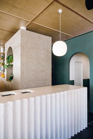
Sculptural, solid forms disrupt and adjust the pedestrian flow through the space.
Despite its awkwardness, the place had always functioned as a convenient shortcut, so a basic requirement was not to completely enclose the space. Sans-Arc’s solution was to identify the natural pedestrian circulation paths, overlay and reinforce those with patterns of efficient restaurant management, and create a pavilion of surprising openness and urban cool within the motley framing of architectural rear views. For the site is defined by the backs of three civic and architecturally robust entities: the Neo Italianate Adelaide Town Hall (1866), the Gothic Revival Pilgrim Uniting Church (1867) and the brutalist ACC offices (1978). Marovich initially felt apprehensive about working in such close proximity to these fine buildings, and the surrounding demographic is by no means orthodox hipster territory.
But the interstitial siting catalyzed the project’s distinctive identity, and graphic designer Carlo Jensen came up with the name Part Time Lover to play on the idea of a hidden secret, or, in this case literally, a “bit on the side.” The food and drink service likewise plays on the concept, aiming to be reliably accommodating and available at all sorts of times of the day.
The arch is used to both acknowledge and differentiate from the surrounding heritage buildings.
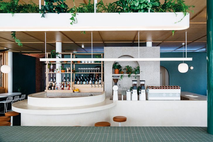
At the conceptual level, however, Part Time Lover takes its influences from less tongue-in-cheek sources, and demonstrates the collaging of culture, time and place that the current generation of designers are adept at. Marovich cites the inspiration of Nepalese and Indian sun rooms – simply constructed spaces wrapped internally in timber, with a continuous band of windows able to be thrown open or closed up, according to the weather. Yet, moments later, he describes how Mies van der Rohe’s Berlin Museum – miles away geographically, technologically and in scale – stayed in his mind as a quintessential pavilion of regular geometry and defining roof canopy. These spatial precedents are hybridized and translated with an ethos of more sustainable and regionally specific attitude to construction. Consequently, there is lots of timber (“We are timber-obsessed,” says Marovich), Mintaro slate floor and local stone podium to connect the material palette to place, while passive ventilation, radium gas tube heating and a purpose-designed lighting system respond to issues of ethical energy consumption.
Defining the subdivision of the plan around service and sculptural dining elements (like the concrete bar, long-tiled bench table and banquettes) reinforces these layers volumetrically and practically. A recurrent circular geometry softens edges and knits with thickened arches used for elevational emphasis. One of Sans-Arc’s trademark devices, the arch is a motif of loaded architectural grammar, used here to both acknowledge and differentiate the surrounding languages of the heritage buildings.
Sans-Arc translates as “without architecture.” This doesn’t mean doing without the accumulated knowledge of the discipline, as the studio’s intelligent handling of functional and symbolic aspects shows. Instead, it refers to Sans-Arc’s desire to also take inspiration from outside the norms, from the vernacular or popular culture, to tease out or create new memories. This latest addition to Sans-Arc’s portfolio balances playfulness and substance to transport you – albeit briefly – to another place, just as a part-time lover might do.
Source: Architecture - architectureau


