Berlin’s Jewish Museum is among the largest and most famous of its kind in the world. Yet the permanent exhibition, unlike the acclaimed Daniel Libeskind building that houses it, has long been considered old-fashioned and clunky—in short, always something of a disappointment.
Since January 2019, the Libeskind galleries, which were frequented by more than 11 million visitors since opening in 2001, have been closed for a comprehensive refurbishment due for completion this summer. The museum announced yesterday that—after some delay—visitors will be welcomed on August 23.
Given both the institutional context and the wider political landscape, this major reboot has curators and designers balancing on a tightrope. Last year, its director Peter Schäfer resigned after a series of incidents for which he was criticized for being too outspoken in the Israel-Palestine debate. Outside the museum, both in Germany and abroad, right-wing populism and anti-Semitism are on the rise, making this institution more important than ever.

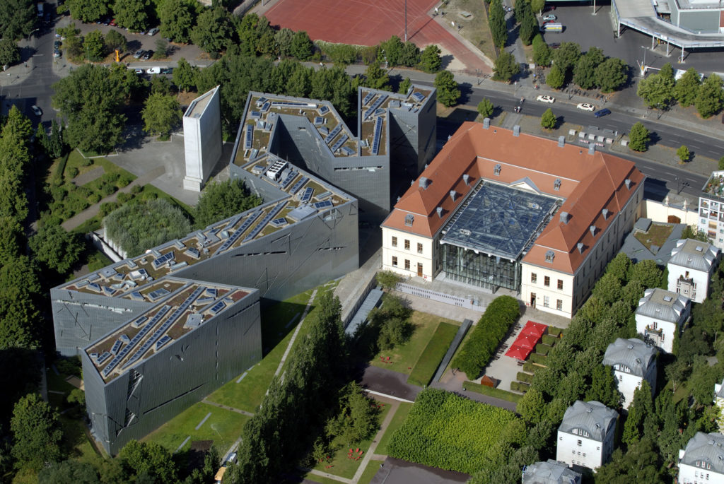
Aerial view of the Jewish Museum Berlin, Libeskind Building © Jewish Museum Berlin. Photo: Günter Schneider.
An Institution as Sculpture
Amid such high stakes, the Berlin-based design office chezweitz has been tasked with integrating the museum’s heavy content into its existing architecture in a way that draws viewers in and brings them along. Walking through its empty galleries while the project was still underway, difficult questions emerged: How do you design exhibitions within a building already so thoroughly designed? And how might design accommodate a history ridden with tragedy without succumbing to cliché or kitsch?
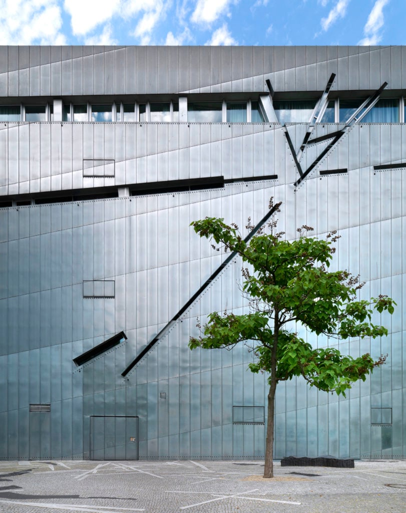
In a city of few architectural wonders, not only as far as museums go, Libeskind’s landmark is tied only with Mies van der Rohe’s Neue Nationalgalerie—an uncompromising glass box with a levitating roof—and David Chipperfield’s poetic restoration of the bombed-out Neues Museum. In the shape of a lighting bolt, or a broken star of David, Libeskind’s zinc-clad structure, cut up by slitted windows, is a sculpture. It stood empty for years before the unveiling of the permanent exhibition in 2001 and, considering that Peter Eisenman’s Memorial to the Murdered Jews of Europe wasn’t finished until 2005, in its vacant state, the Jewish Museum effectively served as the German capital’s primary Holocaust remembrance site. And as such—I’ve heard time and time again—it was perfect.
Yet Libeskind seems to have considered every detail except how his idiosyncratic galleries could possibly fulfill the purpose they were designed for, namely housing a presentation of historic ephemera, artworks, and artifacts. The architecture, quite simply, is too busy exhibiting itself. For that reason, the permanent exhibition on view for the better part of the last 20 years was something of an : a stew in which the individual ingredients disappear into a murky whole. Too full and too monotonous, each chapter simply followed the next in an uneventful continuum. In what was presumably an attempt to lend prominence to the surroundings, the display and architecture ended up sounding each other out.
In 1999, in the early stages of his career, architect Detlef Weitz submitted a bid in the public debate over a future Holocaust memorial that would become Eisenman’s famous work. “In Libeskind’s building you already have your memorial,he wrote to the city, “just leave it empty.” It is ironic that now, as head of chezweitz, which is among Europe’s leading exhibition design firms, Weitz is tasked with filling up the very same rooms he once advised to leave alone. He and his team have been reworking the 3,500-square-meter (38,000-square-foot) building since 2016, and the roughly €6.5 million ($7 million) project is set to be unveiled to the public in August.

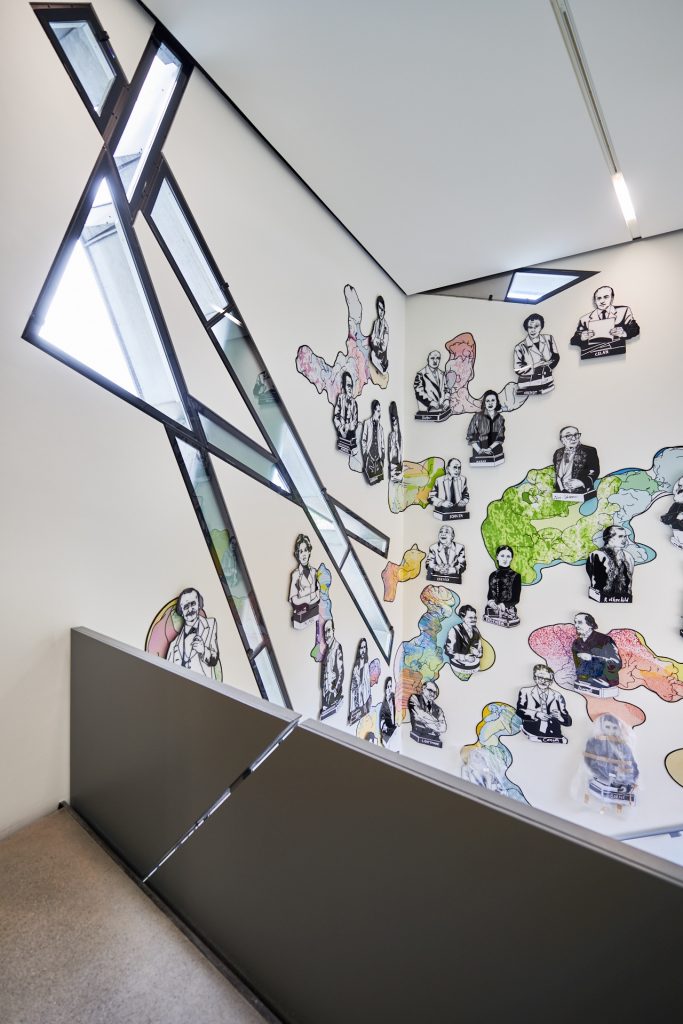
Bowing to a number of Jewish personalities in the Hall of Fame of the Jewish Museum Berlin’s new core exhibition (illustrations: Andree Volkmann). Jewish Museum Berlin. Photo: Yves Sucksdorff.
Histories and Voids
The new exhibition “Jewish Life in Germany: Past and Present” is broken off into five chapters spanning the Middle Ages to the present. The building’s updated design is deliberately disorienting, intending to mirror the tortured and winding trajectory of Jewish history. “Our challenge as designers has been to maintain this sense of disruption, while at the same time making a functional exhibition,” Weitz told me as we stood in the half-finished installation. In the main concourse, Libeskind’s black “void-bridge” stretches the length of the complex, interrupting the flow of its various galleries and allowing only partial views into its “memory voids”—large, bare, and sometimes inaccessible concrete shafts at the building’s core.
Because this state of disharmony is essential to the power of Libeskind’s spaces, Weitz and his team have taken on the task of matching or even exacerbating its symbolic potency. Where the old exhibition used a similar design scheme for the entire display, chezweitz has opted for a series of distinct and characteristic spaces that each respond to the architecture in their own way. In rendering the fatal claustrophobia of the World War II years, for instance, semi-reflective steel plates suspended from the ceiling are scarred by narrow glass vitrines, which are also reminiscent of the windows to the outside.
“Here we really made an effort to avoid the material clichés of Holocaust memorial architecture,” said Weitz, listing the rusted metal and raw concrete that is typically mobilized to lend gravity to memorials around the world. Instead, their maze of knife blades merges with the black void bridge, enriching the existing symbolic vocabulary. “It will be brutal because it’s perfect,” he added. If Libeskind’s metaphors have always seemed somewhat contrived, the incorporation of them into the exhibition itself, even in its current half-built state, turns them winningly self-evident.

Exterior view of the Jewish Museum Berlin, Libeskind Building © Jewish Museum Berlin. Photo: Jens Ziehe.
Between Facts and Drama
As for art, as part of the revitalization, German artist Anselm Kiefer is creating a much-anticipated work about the Kabbalah. The existing installation, an epic and solemn piece by Israeli sculptor Menashe Kadishman—more than 10,000 faces with open mouths cut from heavy iron plates that cover the floor of one of the memory voids—will be complemented by a more uplifting face-based artwork by illustrator Andree Volkmann. In a previously blank staircase connecting the two floors of the exhibition, Volkmann has portrayed a diverse list of famous Jewish personalities—from Jesus to Weimar-era Foreign Minister Walther Rathenau and Amy Winehouse—on a backdrop of dreamy pastel-colored clouds that doubles as a selfie spot. It’s a welcome moment of levity before the exhibition turns to the 20th century.
While artworks can introduce a helpful sense of ambiguity and poetry, in a context like this museum, their qualities are just as often not what is required. A gallery about the legal restrictions imposed upon Jews throughout the 1930s might have been the subject of another art commission, or some creative sentiment could have helped to bring home the point. But this content needs more specificity and less subjectivity than is typically offered by an artwork; here, unpoetic documentation is crucial.

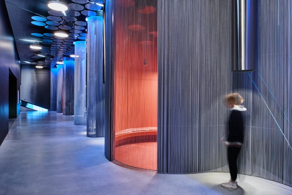
What is Jewish music? View of the Music Room, one of the eight thematic spaces of the Jewish Museum Berlin’s new core exhibition. Jewish Museum Berlin, Photo: Yves Sucksdorff.
Weitz’s solution delivers on both facts and drama: layers and layers of paper measuring the height of the room bear the laws issued by Germany that gradually turned Jewish life into an oxymoron after 1933. In these rooms, the procedure by which barbarism was veiled by bureaucracy is given material form in a way that is both moving and straightforward.
As the timeline of the exhibition moves into the 1940s, the paper walls turn to steel, and you notice your own blurred reflection—a gesture both to identity and complicity. On the other side of this dark chapter follows one about anti-semitism in our contemporary moment. When the museum and chezweitz started working on the project, this section was somewhat meager. Now, following dramatic right-wing riots in the German city of Chemnitz and elsewhere since 2018, Weitz calls it “one of the most important parts of the exhibition.” One hopes another update won’t be necessary for a while.
Source: Exhibition - news.artnet.com


